
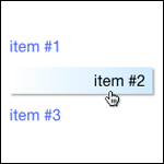
The vertical menu knows how far to animate by getting the width of the div it’s located within.
The snippet of code below is the html for our vertical menu. Take note of the span tag with class v_item. It is inside our anchor tag which is a block item.
Responsive Vertical Menu HTML
<div id="v_nav" style="width: 30%;">
<ul class="v_navbar">
    <li><a href="#"><span class="v_item">item #1</span></a></li>
    <li><a href="#"><span class="v_item">item #2</span></a></li>
    <li><a href="#"><span class="v_item">item #3</span></a></li>
</ul>
</div>
Responsive Vertical Menu CSS
There is additional CSS such as CSS clearfix, but this is simply the CSS for the vertical menu.
/* Vertical menu BEGIN */
ul.v_navbar {
    list-style-type: none;
    width:100%;
}
.v_navbar li {
    text-align: left;
}
.v_navbar li a {
    text-decoration: none;
    color: #3366ff;
    margin-bottom:8px;
    display: block;
    padding-top: 6px;
    padding-right: 0px;
    padding-bottom: 6px;
    padding-left: 0px;
    font-size:16px;
}
.v_navbar li a:hover {
    color: black;
    background: rgb(255,255,255); /* Old browsers */
    background: -moz-linear-gradient(left,  rgba(255,255,255,1) 1%, rgba(203,235,255,1) 100%, rgba(161,219,255,1) 100%); /* FF3.6+ */
    background: -webkit-gradient(linear, left top, right top, color-stop(1%,rgba(255,255,255,1)), color-stop(100%,rgba(203,235,255,1)), color-stop(100%,rgba(161,219,255,1))); /* Chrome,Safari4+ */
    background: -webkit-linear-gradient(left,  rgba(255,255,255,1) 1%,rgba(203,235,255,1) 100%,rgba(161,219,255,1) 100%); /* Chrome10+,Safari5.1+ */
    background: -o-linear-gradient(left,  rgba(255,255,255,1) 1%,rgba(203,235,255,1) 100%,rgba(161,219,255,1) 100%); /* Opera 11.10+ */
    background: -ms-linear-gradient(left,  rgba(255,255,255,1) 1%,rgba(203,235,255,1) 100%,rgba(161,219,255,1) 100%); /* IE10+ */
    background: linear-gradient(to right,  rgba(255,255,255,1) 1%,rgba(203,235,255,1) 100%,rgba(161,219,255,1) 100%); /* W3C */
    filter: progid:DXImageTransform.Microsoft.gradient( startColorstr='#ffffff', endColorstr='#a1dbff',GradientType=1 ); /* IE6-9 */

    -webkit-box-shadow:  2px 2px 2px 0px rgba(0, 0, 0, .3);
    box-shadow:  2px 2px 2px 0px rgba(0, 0, 0, .3);
}
Responsive Vertical Menu jQuery
We use the jQuery .width() function to get the width of the container the menu items are in. (More on .width()) This is where we make use of our span tag. Because all of our anchor tags are display:block, they are the full width of the div they are in. Because we put a span tag around the text in the anchor tag we can get the width.
Here is the basic concept:
Total Width – Anchor Text Width = Movement Width
We use the .stop() function in case we hover over multiple menu items or hover multiple times. If we don’t use it jQuery will execute the animation for each hover. We use .this() with .find() to animate only the specific .v_item we are hovered over, otherwise all menu items will animate because they all have th class .v_item.
$(document).ready(function($) {

    $('ul.v_navbar>li').css({ "width": "100%"}).find('a').hover(
        function(){
            //We get the total width of the div the menu is in.
            var totalWidth = $(this).width();
            //we get the width of the menu items text
            var itemWidth = $(this).find('.v_item').width();
            // If we the item Width from the total Width it will give us the space left over
            // BUT... we will use only 95% of the total Width so that when the text moves to
            // the right it wont go right to the edge
            var moveWidth = totalWidth * .95 - itemWidth;
            //alert(wi + " - " + smlWidth + " = " + moveWidth);

            $(this).find(".v_item").stop().animate({
                "margin-left": moveWidth
            }, 500 );
        },
        function(){
            $(this).find(".v_item").stop().animate({
                "margin-left": "0px"
            }, 500 );
        }
    );

    //Modernizr Detect touch
    if (Modernizr.touch){
        // bind to touchstart, touchmove, etc and watch `event.streamId`
    }
    else {
        // bind to normal click, mousemove, etc
    }
});It’s not included in this tutorial, but if you want to take you responsive design further, check out modernizr.


